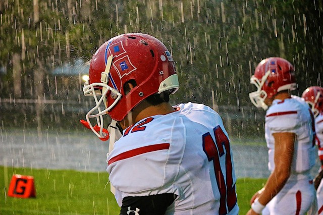
Iconic. It’s an adjective that is defined as a widely recognized and well-established. It’s also described as widely known and acknowledged especially for distinctive excellence. We use the word to describe a “brand” often times. We use it to describe images that are engrained in our memories like the golden arches of McDonalds or an apple with a bite out of it that represents well, Apple.
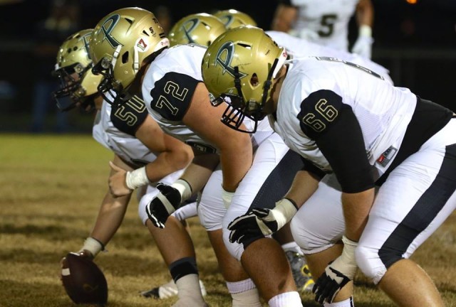
We also use it to describe our favorite “logos” for our sports teams. We wouldn’t be spending upwards of three or four figures for gear with logos of years past–or perhaps current–if it weren’t for their iconic status, right? The same can be said for the helmets that our favorite football teams wear. In today’s day-and-age, it seems like a bunch of the collegiate and professional teams are constantly tweaking something with their designs. High school is no different. The University of Oregon ruined it for programs that just want to keep it simple every year. It’s becoming tougher and tougher to recognize your team out there.
That’s why we’ve chosen seven teams from our area that have reached this sort of “iconic” status due to the fact they’ve kept it simple long enough for us to know who’s in the house without even seeing the rest of the uniform. Of course, some are going to be salty just like they were over the uniforms article we posted earlier in the week, but if you stop and think about what “iconic” means, you shouldn’t have a hard time understanding how these seven made it. We’ve also got a few teams that are going to make this list in the not-so-distant future if they don’t change things, so see who would hypothetically round out the top ten.
The list is in ALPHABETICAL, not ranking order. The challenge posted to you will be to hit up our message board and rank them yourselves. Remember, if you’ve had your current logo for less than four or five years, you have yet to establish a brand. That’s just the way it is unless you’re winning every game by six touchdowns, four-time consecutive champs and smack-dab in the stream of consciousness on the minds of people spread out over six counties. People will most likely recognize your fashion sense and sensibilities before they recognize the scoreboard. We didn’t make the rules, it’s human nature.
Here are our choices for “most iconic” helmets in the BCP coverage area.
 ARMWOOD: Some folks “might” disagree with this one right off the bat, because not “too” long ago, Armwood had a different design. They’ve had an ‘A’ and “Hawks” on the side of their helmet in years past, but after changing to the Hawks’ head a while back, they easily have one of the most-recognizable helmets in this area. Granted, the Hawk is widely-used throughout the country in high school and college, which takes “some” of the originality out of the mix in terms of judging, but when it comes to associating that mascot on the helmet and those colors, it’s unmistakable who’s pulling up to your field to play. That’s brand recognition and that’s iconic.
 HILLSBOROUGH: The Terriers are one of the charter members of the FHSAA when it was created in 1922 and have been playing football for longer than that. With a history that long, we’d be naive to think there weren’t some changes made at times, but when you think of Hillsborough High School, you think of that gigantic white or black ‘H’ on the side juxtaposed to a red canvas. The big block lettering is such a classic look and it really doesn’t matter the letter, it’s the fact that when you see that ‘H’ and see the colors, you know what time it is. It’s like the red ‘W’ on Wisconsin’s helmet or the red ‘S’ on the side of Stanford’s. They could have gone with a fierce looking terrier on the side, but they went with the ‘H” and that’s just fine. Notice a theme developing, yet?
 LAKELAND: Nobody likes an ‘L’. They don’t like taking them to an opponent, they don’t like taking them in a relationship, they’re just not fun by today’s standards as referenced to the letter ‘L’. If you’re a Lakeland Dreadnaught or have played them in the last in the last–say, FOREVER–you’ve noticed one thing–there’s L’s everywhere you go, and they’re proud to show them off–and for good reason. That orange L set on a black helmet has been terrorizing programs for multiple decades and is easily one of the most-recognizable images in the state, let alone area. Unless you’ve been living under a rock and new to this high school football thing in Florida, that letter–and those helmets–are simply too hard NOT to associate with all things Lakeland Football. Although a battleship would look pretty damn cool, that L signifies W’s.
MANATEE: Hurricanes and Florida are like peanut butter and jelly. The actual meteorological events can be considered part of Florida’s “brand recognition” and a couple of our football teams have carried the torch with that recognition on the gridiron. We all know about “The U” and that classic design, but when your school doesn’t have that particular vowel in its name, what do you do when your mascot is a spinning path of destruction? You go with the warning flags, which are pretty cool themselves. That’s what Manatee has had on the side of their helmets forever it seems and this year they’ve even got a white helmet with the logo. The ‘Canes are an integral part of Florida HSFB’s history and beyond their state championships and pipeline to the colleges and pros, they’ve got one of the most-recognizable headpieces in the entire sport.
 PLANT: You see that gold helmet with the black ‘P’ in the hands of the players getting off the bus and you know what’s about to happen. You’re about to play the Plant Panthers. All throughout their historical runs to titles in different classifications, the Panthers have kept that letter on the side of the helmet in spite of some uniform changes. The Panthers have been on all over national television as well as statewide wearing the ‘P’ and have established themselves as a national brand like Armwood, Lakeland and Manatee. Had they changed logos things might be different. But every time you see the Panthers take the field no matter the color scheme, they’ve got those shiny gold helmets with that uniquely-designed ‘P’ that separates them from looking like Purdue. It’s original and it’s iconic in these parts for sure.
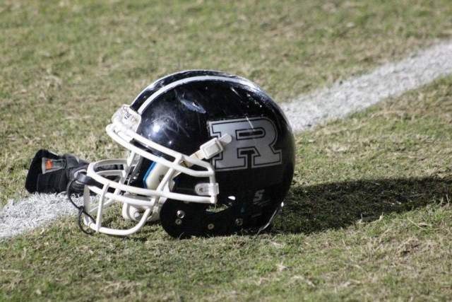 ROBINSON: You may be thinking their helmet is just two of the most basic colors in the palette, and technically you’d be right, but this helmet means everything to the school and the community. While some folks may be scratching their heads, this one’s an easy one for us and it’s a nod to some of the most-loyal and fiercest supporters in the entire region that hail from Port Tampa. Question it if you must, but that solid white ‘R’ set on the glossy black helmet has been worn by some of the best players to ever come out of high school in Tampa. The “old heads” and the “youngins” alike that didn’t even attend there can take one look at that helmet and tell you who that is. That’s brand recognition, and that’s iconic.

SOUTHEAST: The school that turned everyone’s world upside down when they were a kid. The school nicknamed the Seminoles that produced one of the great athletes of a generation that played in garnet and gold, yet their colors are orange and blue. After the original culture shock of seeing that and having to ask so many questions, the helmet itself has become one of the most-recognizable in the area and state over the years. Sure there’s other schools rocking the FSU spear on the side of the helmet AND with that color scheme such as Osceola, but when you go back and look at the iconic history that this program has, you’ll quickly see who the deans of this look really are. They’ve had some lean years recently, but in their heyday, that helmet produced fear and even with all of the subtle changes to their uniforms, they’ve kept this timeless look on their heads keeping that brand going.
OTHER SCHOOLS THAT COULD BE ON THIS LIST SHORTLY:
JESUIT – The Tigers have a nice, two-color classic look with a Tigers head on the side.
CCC – LOVE, LOVE, LOVE the Michigan ERRR Princeton-style winged helmets
KATHLEEN – That ‘K’ is starting to become synonymous with Red Devil Football beyond the borders of Polk County