Some folks are gonna be REAL salty after reading this. It is a guarantee like the sun rising in the east and setting in the west. Everyone thinks they’ve got the best look when it comes to uniform swag, but the harsh reality is that some–make that a few–are doing it MUCH better than others. There are some schools that have more combinations than a Kardashian in their repertoire and often times they over-think they process, but within those countless combos, there are some that hit the nail on the head in terms of look-good, feel-good, play-good–so we’ve highlighted those teams as well.
The thing about assessing uniforms is that it’s just like assessing art. The evaluation and the like/dislike is based on personal preference. Consensus is tough to find. Judging the “best” look on the field is essentially beauty being in the eyes of the beholder. Let’s face it, some combos and color schemes are simply atrocious, but programs have to do the best they can with what they can–so no need to put those teams on blast. Other schools’ have their helmet swag on “fully turnt” status, but are wearing uniforms WE SWEAR were around twenty years ago–so that might exclude a few on this list.
What you’ll find on this list might surprise you. There’s the top four teams that are simply doing it–or shall we say “did it” right last season and hopefully will continue with the current looks. There’s another eight to ten programs that will be highlighted for certain combos that look clean as all-get-out when they wear them. The criteria that was used in the process for judging produced results that were based on looks that presented a “classic” or “timeless” feel to them and perhaps bear striking resemblance to collegiate programs. Let’s see who made the list and start the debate, shall we?

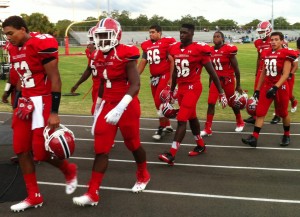
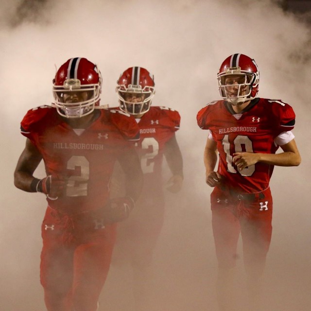
HILLSBOROUGH – There’s a lot to like about the Big Red and their look. Under Armour does just about as good as anyone out of the apparel companies when it comes to their reds and blacks in terms of their “crispiness” a la schools like Utah or Maryland. The best part about the Terriers’ look is that their red/black pairs with the gray that’s been trending all over the country the past few seasons. Everyone wears gray, but not everyone can pull it off including the black and gold teams of the world believe it or not. Not to mention the fact that Hillsborough’s white uniforms with the red/black accents are just as mean-and-clean as the all-red, all-black or all-gray giving HHS one of the most-diversified sets of options while not looking like a Kanye West-fashion-week-failure. Other teams doing well with the red/black/white/gray looks are Kathleen and Clearwater.
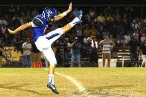
ARMWOOD – The Hawks weren’t as clean in recent seasons with their Nike uniforms that were rather boring to be honest. It’s amazing what a little cleaning up will do for you and that sprucing up came courtesy of Under Armour. The Hawks kept the same helmets, but made some changes to their monochromatic tops and bottoms. They stuck with their recognizable blue and white, but eliminated a lot of the black. The black/white designs on the shoulders find themselves contrasting the blue nicely while the white bottoms have a blue/black stripe that perfectly accents the pants. You don’t have to do much to blue/white/black to make it look clean, but you can certainly overpower the color combo with monochromatic mismatching like they used to. Something that we’d be interested to see is if they were to work in maroon instead of black–which is actually one of the schools’ colors.

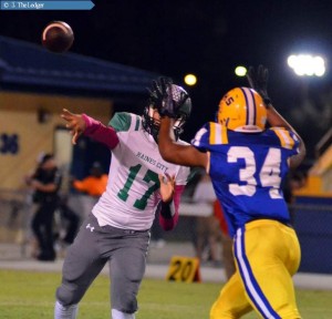
AUBURNDALE – The ‘Hounds went with a Tigers look and it looked on point to say the least. Less is more when there’s a bazillion schools with “royal blue and gold” in your color scheme. Sometimes you don’t have to get all creative and look like a Napa Auto Parts mascot by the end of the day. Sometimes–you can simply take the timeless design of LSU’s uni’s and simply swap the purple for royal blue. A-Dale’s gold isn’t necessarily gold, which made it a perfect fit for this combo. The away combo is yellow helmet/white tops with blue shoulder stripes/yellow pants with blue/white stripe running down the length of the leg. Home combo–just put the royal blue top on. It’s literally the same look for the fellas in Baton Rouge on a Saturday–and we’re not complaining. Should be noted that Adidas is the uniform supplier.
ADMIRAL FARRAGUT – Slightest bit of nuance applied here, because without the helmet that’s a dead-ringer for the Naval Academy–this combo looks slightly different. Without the helmets, and they’d have a Penn State vibe, but with the helmet, there’s a striking contrast with the all-white tops/bottoms that leads up to the two-tone navy/white helmet. They wear the all-navy tops/bottoms, the helmet pops with the white in it. There’s just something about this look that we really like.

The Honorable Mentions include:
Jefferson – Their all-blue combo with yellow numbering paired with their winged helmets looks super clean.
Robinson – Anytime they put the white tops with gray bottoms and pair that with their black helmets is a nice look.
Berkeley Prep – Their navy helmets, Columbia Blue tops and navy bottoms look awesome.
George Jenkins – Gold helmets/green tops/gold bottoms remind us of Notre Dame alternate throwback uniforms.
Plant/Mitchell – Their all-blacks with their gold helmets, is a great look. Not necessarily their gray.
Haines City – Their combo with the green helmets, white tops and grey pants looked surprisingly sharp.
Brooksville Central – Love their all-navy with silver helmets or all-silver look is pretty nice.
Gaither – Good, clean usage of their navy and silver pretty much all the time.
River Ridge – Away uniforms are little busy, but their all-Royal Purple tops/bottoms & black helmets pop big-time.
Nature Coast – The all-black tops/bottoms with Columbia Blue accents and white helmets is nice on the eyes for sure.
Brandon – Striking resemblance to the University of Alabama. Such a timeless, classic look that arguably deserves to be on the best-dressed list quite frankly.
